
Ultimate Guide to Investor Dashboard Design in CRE
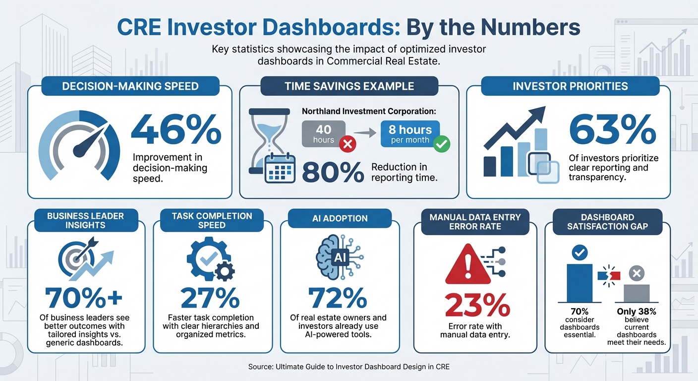
In commercial real estate (CRE), investor dashboards are essential for making quick, informed decisions. They consolidate data like rent rolls, lease agreements, and expenses into a single, near real-time interface. This eliminates delays caused by outdated reports and manual processes. For example, Northland Investment Corporation reduced reporting time from 40 hours to 8 hours per month by automating their dashboards.
Key takeaways:
- Dashboards improve decision-making speed by up to 46%.
- Transparency is critical: 63% of investors prioritize clear reporting.
- Automated systems like CoreCast simplify data integration and analysis.
This guide covers:
- Data sources and tools for CRE dashboards.
- Designing effective layouts with KPIs and visualizations.
- Avoiding common pitfalls like clutter and outdated data.
Key Statistics for CRE Investor Dashboard Design and Implementation
Real Estate Analytics: A Complete Power BI Dashboard
Data Sources for CRE Investor Dashboards
To build effective dashboards, you need more than just financial statements like income statements, balance sheets, and cash flow reports [2]. While these are essential, they don’t paint the whole picture. You’ll also need operational data - think rent rolls, lease structures, occupancy rates, tenant turnover schedules, and lease expiration dates. Together, these details give investors a comprehensive view of property performance [2][1].
The quality of a dashboard hinges on the accuracy of its data. Automated integrations help eliminate manual reconciliation errors and significantly reduce reporting time [1][2]. But this efficiency depends on starting with clean, consistent, and well-integrated data.
Primary Data Inputs
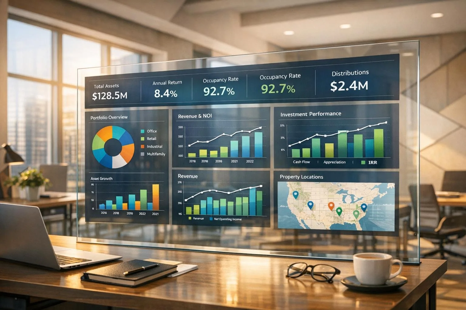
A successful dashboard blends static property details (like location, square footage, and property type) with dynamic metrics such as Net Operating Income (NOI), Internal Rate of Return (IRR), and Cap Rate [2][1]. These metrics let investors quickly gauge whether a property is meeting its projected returns.
Each asset type has unique data requirements. For retail properties, you’ll track metrics like sales per square foot and foot traffic. Industrial properties demand data on clear height and loading dock ratios. Multifamily buildings focus on rent per unit and concessions offered, while hospitality properties monitor Revenue Per Available Room (RevPAR) and Average Daily Rate (ADR). Additionally, accounting records - such as general ledger details, accounts receivable aging reports, and budget-vs-actual comparisons - are critical for identifying operational variances before they escalate [5][1].
It’s also crucial to define your NOI methodology upfront. Teams often differ on what reserves or capitalized expenses to include, so setting clear rules in your dashboard ensures consistent reporting [1]. Without this clarity, you risk presenting inconsistent figures to investors, which can quickly erode trust.
Pulling Data from CRE Software
Once you’ve identified the key data points, the next step is to gather them efficiently. Most firms rely on property management systems like Yardi, MRI, and Entrata, accounting software like QuickBooks, and underwriting tools like Argus [5][1]. The challenge isn’t just extracting the data - it’s ensuring it flows smoothly and automatically. Manual CSV uploads often lead to reconciliation errors and outdated information [1]. Automated syncs and on-demand updates are essential for keeping dashboards accurate and up-to-date [1].
"Enter it once and use it many times. Ideally, you want data to be able to be shared with every system in your environment from asset management to accounting." - One11 Advisors [6]
Managing multiple properties adds another layer of complexity. It’s essential to map your chart of accounts across all entities to maintain consistency in portfolio-level reporting [1]. For example, one property might classify insurance under "Operating Expenses", while another lists it under "Administrative Costs." Starting small can help - begin with a single data extract from Yardi, like AR Aging or Budget vs. Actual, to avoid the technical hurdles of complex data modeling [5]. Once that’s running smoothly, you can expand to include sources like VTS for leasing pipelines, NCREIF for market vacancy rates, or platforms like Yardi Matrix for competitive benchmarking [4].
The technical infrastructure matters too. Many firms opt for cloud-based hosting for its accessibility and scalability, though some prefer on-premise solutions for handling highly sensitive data [5][1]. Regardless of your choice, it’s vital to establish role-based security so that investors, operators, and analysts see only the information relevant to their roles. This safeguards sensitive details while maintaining the transparency that 63% of investors say is crucial to their investment relationships [2].
With this streamlined data integration in place, you’re ready to design dashboards that are both intuitive and insightful.
How to Design Investor Dashboards
Once you've integrated your data, the next big step is creating an actionable dashboard. The goal here isn’t just to make something that looks good - it’s to design a tool that helps people make faster, smarter decisions. In fact, over 70% of business leaders say they see better outcomes when using tailored insights instead of generic dashboards [3].
Dashboard Layout Basics
A well-designed dashboard relies on a clear visual hierarchy. Start with your most important KPIs - like portfolio IRR, total NOI, or overall occupancy rates - at the top. Use the middle section for trends and comparisons, and save the bottom for more detailed or drill-down data that users can explore as needed.
Organize the layout to match natural reading patterns, such as the F or Z layout, which aligns with the "five-second rule" [3]. If it takes longer than five seconds to understand the dashboard, you might be cramming in too much or burying the key takeaways.
"Every dashboard needs to tell a story visually, so we work with stakeholders to determine a common end goal and work backward from there, making metric suggestions that can all help keep the 'story' on track."
– Fernando Lopez, Circuit [3]
Simplify the view with progressive disclosure - start with a high-level portfolio summary and let users drill down into the details as needed. Group related metrics together (e.g., financial data in one section, operational stats in another) to make navigation intuitive and reduce mental effort. Also, round off numbers for easier readability - 23.7% is much quicker to process than 23.6847%.
With your layout in place, the next focus is on choosing the right visualizations.
Selecting the Right Charts and Graphs
Different data types demand different types of visualizations, so picking the right chart is crucial. Here’s a quick guide to help:
- Line charts: Best for tracking trends over time, like NOI growth or occupancy rates.
- Bar charts: Great for side-by-side comparisons, such as benchmarking property returns or assessing performance against budgets.
- Pie or donut charts: Useful for showing proportions, like asset allocation by property type or expense breakdowns.
- Waterfall charts: Perfect for illustrating how various revenue and expense components impact NOI.
- Heat maps: Ideal for visualizing geographic risk or regional performance.
- Gauges: Provide quick "health checks" on metrics like rent collection or maintenance resolution times.
| Chart Type | Best Use Case in CRE |
|---|---|
| Line Chart | Tracking NOI growth or occupancy trends over time |
| Bar Chart | Comparing performance across properties or benchmarks |
| Pie/Donut | Showing asset allocation or revenue sources |
| Waterfall | Breaking down components of overall performance |
| Heat Map | Assessing geographic risk or regional performance |
| Gauge | Monitoring metrics like maintenance resolution times |
Always provide context for your visuals. For example, add reference lines to charts to highlight targets, portfolio averages, or moving averages. This helps users quickly determine whether performance is on track. Comparing current metrics to historical data, budgets, or industry benchmarks makes the insights even more actionable.
"The greatest value of a picture is when it forces us to notice what we never expected to see."
– John Tukey [3]
Making Dashboards Accessible and Easy to Use
Accessibility is key to ensuring that everyone can use your dashboards effectively. Since about 1 in 12 men and 1 in 200 women have color vision deficiency [4], don’t rely solely on color to convey meaning. Use high-contrast color combinations and add icons or patterns to make the information clear for all users. Standardize your color coding - for instance, green for positive trends and red for alerts or underperformance - across all views.
Responsive design is another must-have. Executives and asset managers often need to check KPIs on the go [1], so your dashboards should adapt seamlessly to mobile devices. Ensure smaller screens still display critical information without clutter. Consistency in design - uniform fonts, sizes, and color palettes - also helps reduce the learning curve.
Finally, always include a "last updated" timestamp so stakeholders know how current the data is. Tailor views based on the audience: investors typically need high-level summaries and polished, branded reports for sharing; operators benefit from real-time property data with alerts; and analysts require detailed data with advanced filtering and export options. Dashboards with clear hierarchies and organized metrics can boost task completion speed by 27% [3].
sbb-itb-df8a938
Advanced Dashboard Features and Tools
Investor dashboards have come a long way from static spreadsheets. By incorporating advanced features like real-time integration, drill-down capabilities, and predictive analytics, these tools can significantly improve decision-making, speeding up processes by as much as 46% [3]. These enhancements turn dashboards into dynamic hubs where opportunities and risks become easier to spot and act on.
Real-Time Data and Custom Views
Gone are the days of relying on monthly reports. With real-time data integration, you can access up-to-the-minute updates on metrics like occupancy rates, maintenance costs, and ROI. This means you no longer have to wait weeks to uncover issues like a sudden vacancy spike or unexpected expenses. Instead, you can address them immediately, which is especially valuable for managing large property portfolios.
Automated alerts add another layer of efficiency. For example, you can set up notifications for when occupancy drops below a certain threshold or when maintenance costs exceed budgeted amounts [8].
Customizable views make dashboards even more effective by tailoring the experience to different stakeholders. Investors can access high-level summaries with heat maps highlighting geographic risks, operators can focus on real-time metrics like occupancy and maintenance, and analysts can dive deeper with advanced filtering and export options for further analysis. In fact, about 72% of real estate owners and investors are already using AI-powered tools [2], and many dashboards now include predictive analytics to simulate scenarios like interest rate changes or future property valuations based on historical data [8].
These features create a solid foundation for platforms like CoreCast, which takes dashboard functionality to the next level.
Building Dashboards with CoreCast
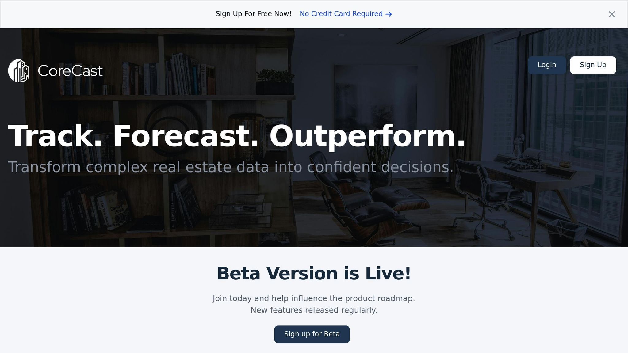
CoreCast, developed by The Fractional Analyst, simplifies dashboard creation by combining underwriting, pipeline tracking, portfolio analysis, and market data into one cohesive system [3][8]. Instead of building dashboards from scratch, CoreCast offers pre-built templates specifically designed for commercial real estate (CRE) workflows. These templates include branded reports, visual summaries, and role-specific views, all of which can be customized to fit your firm's unique needs.
One standout feature is the Key Stakeholder Center, which allows you to manage investor relations with ease. You can create tailored dashboards with varying access levels and branding for different audiences. For instance, you might generate polished, branded reports for external investors while giving internal teams access to real-time data and detailed drill-down options.
CoreCast is currently available at $50 per user per month during its beta phase, with pricing expected to increase to $105 per user per month after its official launch. The platform is also working on adding AI-powered tools for detecting performance anomalies and automating waterfall calculations to further enhance its capabilities [3].
Common Dashboard Design Problems and Fixes
Building on the design fundamentals we've covered, this section dives into common dashboard design challenges and how to address them. Even with solid data integration and thoughtful design principles, dashboards can still fall short. While 70% of business leaders consider dashboards essential, only 38% believe their current dashboards meet their needs [3]. This gap between expectations and reality often boils down to three key issues: overcrowding dashboards with too much information, relying on outdated data, and failing to adapt dashboards for various devices.
Preventing Information Overload
One of the most frequent mistakes in dashboard design is trying to cram every metric onto a single screen. When you overload a dashboard with data, it becomes impossible to focus on what truly matters. A simple way to test this is the five-second rule: if users can’t grasp the dashboard's main takeaway within five seconds, it’s too cluttered [3][4].
"Every dashboard needs to tell a story visually, so we work with stakeholders to determine a common end goal and work backward from there." - Fernando Lopez, Circuit [3]
The solution? Progressive disclosure. Start with high-level summaries, and let users drill down into detailed information only when necessary. For instance, show portfolio-wide metrics like occupancy rates and NOI on the main screen, while keeping individual lease details hidden behind clickable elements [3][7]. This approach keeps the interface clean and user-friendly while still offering access to detailed data. Dashboards that use clear hierarchies and group similar metrics can boost task completion speed by 27% [3].
Another effective strategy is creating role-specific views. Investors might need a high-level summary of portfolio returns and risk exposure, while operators require real-time property-level data, such as maintenance alerts or rent collection updates [3]. By tailoring dashboards to specific roles, decision-making speed can improve by as much as 46% [3].
Once your dashboard is streamlined, the next step is keeping the data fresh and reliable.
Keeping Data Current
Outdated data can quickly erode trust. Manual processes like CSV uploads and copying data often lead to errors and stale information [1]. In fact, manual data entry has an error rate of 23% [10].
"A brilliant dashboard built on bad data is a sure-fire way to base critical decision-making on misleading information." - DataFreedom [4]
The fix? Automated integration with systems like Yardi, AppFolio, or MRI. Direct connections eliminate the need for manual entry, ensuring real-time accuracy [4][1][9]. For example, Northland Investment Corporation revamped its investor reporting in 2025 by implementing automation technology. What once required eight team members and four days was reduced to a single person completing the task in just one day [2].
To further build trust, include a "last updated" timestamp on your dashboard [3]. This small but essential feature reassures users that the information they’re seeing is current and reliable.
With data accuracy addressed, it’s time to focus on making dashboards work seamlessly across all devices.
Optimizing for Multiple Devices
Executives and asset managers often rely on dashboards across a range of devices - smartphones, tablets, and desktops [1][10]. A dashboard that doesn’t perform well on mobile devices is a clear sign of poor design [1].
Responsive design is no longer optional. Dashboards should automatically adjust their layout based on screen size, ensuring critical metrics remain clear and easy to read, even on smaller displays [3]. Use elements like size, color, and placement to guide attention to the most important data, allowing users to scan quickly without missing key insights.
For mobile users, simplify numerical data by rounding percentages (e.g., 23.7% instead of 23.6847%) to make information easier to digest [3]. Remove unnecessary icons, charts, or numbers to reduce clutter and keep the interface clean [3]. Additionally, consider accessibility: around 1 in 12 males and 1 in 200 females experience some form of color vision deficiency [4]. Avoid relying solely on color to convey meaning; instead, pair colors with icons, patterns, or text labels to ensure your dashboard is accessible to everyone, regardless of device or visual ability.
Conclusion
Main Takeaways
Effective dashboards are the backbone of smart decision-making in the CRE world. Instead of cramming in every data point, focus on presenting information that directly supports strategic goals. The most impactful dashboards are fine-tuned to meet the needs of specific stakeholders: investors look for high-level metrics like IRR and equity multiples, operators require real-time property updates, and analysts dive into granular details for modeling. By addressing these distinct needs, dashboards can streamline decision-making processes [3].
A great way to structure dashboards is by using progressive disclosure. Start with high-level summaries and let users dig deeper into the details only when necessary. Also, make sure your dashboard is user-friendly across all devices - from large desktop screens to pocket-sized smartphones.
Take CoreCast as an example. It simplifies underwriting, pipeline tracking, and portfolio analysis by centralizing these processes in one place [8]. With features like AI-powered document parsing and real-time data views, it minimizes manual reporting and eliminates data silos. Currently in its beta phase and affordably priced [8][11], CoreCast is tailored for CRE professionals who need efficiency without sacrificing depth.
Next Steps for CRE Professionals
Now it’s time to put these strategies into action. Start by identifying what matters most to your stakeholders. Conduct interviews to pinpoint the metrics that drive their decisions [3]. Next, audit your existing data sources to ensure they’re accurate and consistent. Clearly define methodologies for key metrics, like Net Operating Income, to avoid confusion down the road [1].
Before fully committing to a design, create a basic prototype and share it with users. This step allows you to gather feedback early, avoiding costly redesigns and ensuring the final dashboard aligns with real-world needs [3]. If you need additional support, The Fractional Analyst offers services like underwriting, market research, and custom financial analysis to complement the CoreCast platform [2]. Thoughtful dashboard design today can give your firm a lasting competitive edge in the CRE market.
FAQs
How do automated dashboards speed up decision-making in commercial real estate?
Automated dashboards have transformed decision-making in commercial real estate (CRE) by cutting out time-consuming manual tasks like collecting, cleaning, and organizing data. These tools directly connect with systems for property management, accounting, and market intelligence, delivering real-time updates on critical metrics such as occupancy, net operating income (NOI), and internal rate of return (IRR). The result? Users gain instant access to accurate, up-to-date insights, eliminating errors and replacing clunky spreadsheets with one reliable, centralized data source.
Beyond just speeding things up, these dashboards come with predictive alerts and tailored visualizations that help investors spot potential issues - like increasing vacancies or unplanned expenses - before they grow into significant problems. They also foster better transparency by giving stakeholders, including sponsors and lenders, real-time access to performance data, reducing the need for constant follow-ups or extra meetings. Platforms like the Fractional Analyst’s CoreCast take it a step further, offering customizable dashboards that empower CRE professionals to make faster, data-driven decisions without waiting on manual reports.
What are the key tips for creating a user-friendly investor dashboard for commercial real estate?
To create a user-friendly investor dashboard, start by identifying the specific goals and key performance indicators (KPIs) that matter most to your audience. These might include metrics like net operating income (NOI), internal rate of return (IRR), occupancy rates, or risk exposure. Keep the focus on the most relevant data to avoid unnecessary clutter and ensure the dashboard delivers a clear and actionable narrative.
Design the layout to prioritize clarity and ease of use. Place critical summary figures at the top for quick access, stick to consistent color schemes and fonts, and use simple, intuitive charts like bar graphs or line trends to visualize data. Adding interactive features - such as filters and tooltips - allows investors to dive deeper into specific details without overwhelming the main interface.
Make sure the dashboard is mobile-friendly, responsive, and secure. Implement role-based access to ensure users see only the information relevant to them. Lastly, the quality of your data is non-negotiable. Validate all data rigorously and integrate reliable systems to maintain trust and provide insights that investors can act on confidently.
Why is integrating data important for creating effective CRE dashboards?
Data integration plays a key role in creating effective commercial real estate (CRE) dashboards by bringing together information from various sources into one dependable platform. By merging data like rent rolls, lease terms, operating expenses, appraisals, and market metrics, these dashboards deliver accurate, real-time insights such as Net Operating Income (NOI) and occupancy rates - without the errors or delays that often come with manual updates.
An integrated system also allows for customized views tailored to different users' needs. For instance, investors can zoom in on portfolio-wide trends, while operators can access property-specific details like maintenance costs or expense breakdowns - all within the same dashboard. This unified setup not only ensures consistent reporting but also simplifies compliance and enhances communication with investors, making it easier to present a clear, data-driven narrative.
For those seeking a streamlined solution, The Fractional Analyst offers services to integrate platforms like Yardi and ERP systems into a single, cohesive dashboard. This saves time, delivers reliable analytics, and enables firms to concentrate on strategic decisions, ultimately improving investment performance.