
Top 7 CRE Dashboard Tools Compared

If you pick the wrong CRE dashboard tool, your team pays for it in manual work, broken reporting, and missed context. I found a simple pattern in these seven options: CoreCast fits teams that want underwriting and portfolio views in one place, Power BI and Tableau fit firms with data staff, Monday.com and Notion fit workflow and docs, Reonomy fits sourcing, and Juniper Square fits investor reporting.
Here’s the short answer:
- Best for all-in-one multifamily acquisitions + reporting: CoreCast
- Best for custom BI with internal data support: Microsoft Power BI
- Best for deep visualization across many systems: Tableau
- Best for task and pipeline coordination: Monday.com
- Best for notes, files, and team knowledge: Notion
- Best for owner lookup and off-market sourcing: Reonomy
- Best for LP/GP portals and post-close reporting: Juniper Square
This comparison looks at four things readers usually care about most:
- Metric coverage like NOI, occupancy, DSCR, cash flow, and rent data
- Integrations with data sources, exports, or outside systems
- Pricing when public pricing is available
- Reporting workflow and how much manual work each tool adds
A few clear takeaways stood out fast:
- CRE-native tools cut setup time
- General BI tools need more build work
- Workflow tools are not financial dashboards
- Sourcing platforms and investor portals solve different problems
7 Best Dashboard Software Tools in 2025 (Full Demo & Comparison)
sbb-itb-df8a938
Quick Comparison
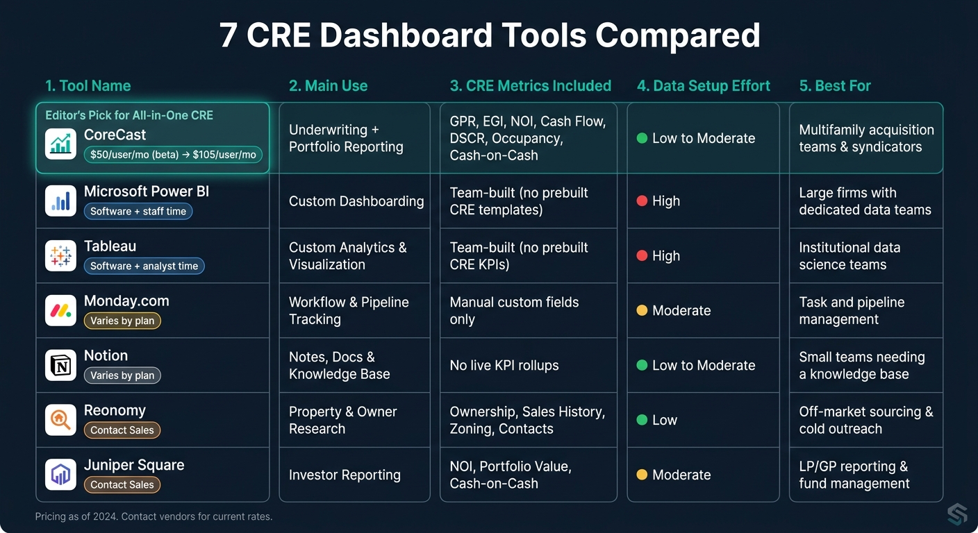
7 CRE Dashboard Tools Compared: Features, Pricing & Best Fit
| Tool | Main Use | CRE Metrics | Data Setup | Pricing Snapshot | Best For |
|---|---|---|---|---|---|
| CoreCast | Underwriting + portfolio reporting | GPR, EGI, NOI, cash flow, DSCR, occupancy, cash-on-cash | Low to moderate | $50/user/month beta; expected $105/user/month later | Multifamily acquisitions teams |
| Microsoft Power BI | Custom dashboarding | Whatever your team builds | High | Software cost + staff time | Firms with data teams |
| Tableau | Custom analytics and visuals | Whatever your team builds | High | Software cost + analyst time | Institutional reporting teams |
| Monday.com | Workflow tracking | Manual custom fields | Moderate | Varies by plan | Task and pipeline management |
| Notion | Notes and docs | No live KPI rollups | Low to moderate | Varies by plan | Internal knowledge base |
| Reonomy | Property and owner research | Ownership, sales, zoning, contacts | Low | Contact sales | Sourcing and outreach |
| Juniper Square | Investor reporting | NOI, portfolio value, cash-on-cash | Moderate | Contact sales | LP/GP reporting |
Bottom line: I’d start with the job you need the tool to do today. If your pain point is underwriting, don’t buy an investor portal. If your pain point is sourcing, don’t expect a task manager to act like a dashboard. That’s the lens I’d use for the full comparison below.
1. CoreCast by The Fractional Analyst
CoreCast is The Fractional Analyst's multifamily acquisition and portfolio reporting platform for CRE teams. It’s built for private equity firms, independent sponsors, and brokerages. In plain English, CoreCast tends to fit best when a team handles both acquisitions and portfolio reporting in one system.
CRE Metric Coverage
CoreCast tracks deals from Sourced to Closed. It also covers rent comps, submarket performance, and supply-demand trends. On the portfolio side, its Portfolio Roll-Up module pulls together GPR, EGI, NOI, and cash flow across the full portfolio. It also calculates DSCR, cash-on-cash return, occupancy, and average rent [5].
That setup is especially useful when teams want their market data and underwriting data in the same place instead of split across a bunch of tools.
Data Integrations
CoreCast integrates with Hello Data for rent trends, supply-demand shifts, and demographic data. It also uses proprietary AI for pattern recognition and predictive analysis [3]. For teams trying to cut down on friction in reporting, that can make day-to-day work a lot smoother.
Pricing Model
CoreCast is currently in beta at $50 per user per month. At full release, pricing is expected to go up to $105 per user per month [6]. The Portfolio Roll-Up module is free [5].
Reporting Workflows
CoreCast auto-populates underwriting and market research into investment summaries, memos, and quarterly reports for lenders, GPs, and LPs [3]. Teams can also apply custom branding before export [3], which helps when reports need to look client-ready without extra cleanup.
2. Microsoft Power BI
Microsoft Power BI can show CRE metrics well, but there’s a catch: your team has to connect the data, clean it, and model it before any dashboard starts to make sense. So while Power BI is flexible, it tends to fit firms that already have a data stack in place and people on hand to support reporting.
CRE Metric Coverage
Power BI can be set up to display property-level cash flow dashboards, underwriting figures, and projected vs. actual performance [2]. It can also track rent assumptions, occupancy, and vacancy.
The main thing to know is this: these dashboards aren’t handed to you as CRE-specific templates. Your team builds them and keeps them running. That lines up with the demands of the data integration layer, because the reporting only works as well as the system feeding it.
Data Integrations
A lot of institutional teams use Power BI as the visualization layer on top of a data warehouse that pulls from APIs. That approach can work well, but only if the firm has enough data engineering support to keep the pipeline stable. Without that support, a complex BI setup is often a poor fit [4].
Pricing Model
Pricing is driven less by the software itself and more by the time and people needed to build and maintain the system.
Reporting Workflows
Once the data pipeline is up and running, Power BI can produce investor-facing dashboards and memo-ready outputs. Investor-ready dashboards can support supportable comps and underwriting memos that need to withstand review from investment committees, lenders, and limited partners [4].
In practice, teams often combine raw data feeds with market data sources so the output holds up under lender and appraiser scrutiny [4]. Property managers can also use BI-backed rent and comp benchmarks to support renewal strategy memos to ownership [4].
Power BI makes the most sense for teams that already have data infrastructure and the internal bandwidth to build on top of it. If that base isn’t there, the flexibility can come with a steep setup cost.
3. Tableau
Like Power BI, Tableau is powerful. But it isn't turnkey for CRE teams. It gives teams a lot of freedom, yet that freedom comes with a catch: you have to build and maintain each dashboard yourself [7].
That’s Tableau in a nutshell. Its biggest plus is customization. Its biggest downside is how much work it takes to turn that flexibility into day-to-day CRE reporting.
CRE Metric Coverage
Tableau does not come with prebuilt CRE KPIs. Teams need to set up NOI, occupancy, lease rollover, and collections on their own. If you want to track economic occupancy, you also need to build concessions and delinquency into the data model [7].
The same goes for lease-expiration tracking. A rolling 90-day lease-expiration model has to be refreshed by hand or synced through an API from the leasing platform [7].
As Rahul Pattamatta of DataBrain said:
"Standalone BI platforms (Tableau, Power BI, Looker) offer full analytical power but require a data team, a warehouse, and ongoing upkeep." [7]
So the hard part usually isn't the chart or dashboard. It's the data layer underneath.
Data Integrations
Tableau usually connects to Yardi, MRI, AppFolio, CoStar, Reonomy, and Excel models through ETL pipelines or a warehouse such as Cherre [4][7].
Pricing Model
The main cost isn't just the software. It's the analyst time needed to build, refresh, and maintain dashboards [7].
Reporting Workflows
Even after the data is connected, there's another issue: will people use it regularly?
Users have to leave Yardi or AppFolio and open Tableau in a separate place. That extra step tends to hurt adoption [7]. In plain English, if a tool lives outside the system people already work in, it often gets ignored.
"Expecting [property managers] to export data, open a separate BI tool, and build their own analysis is expecting something that won't happen consistently." [7]
Tableau tends to fit enterprise teams best, especially those that need analysis across many systems and have the staff to handle steady data modeling [7].
4. Monday.com
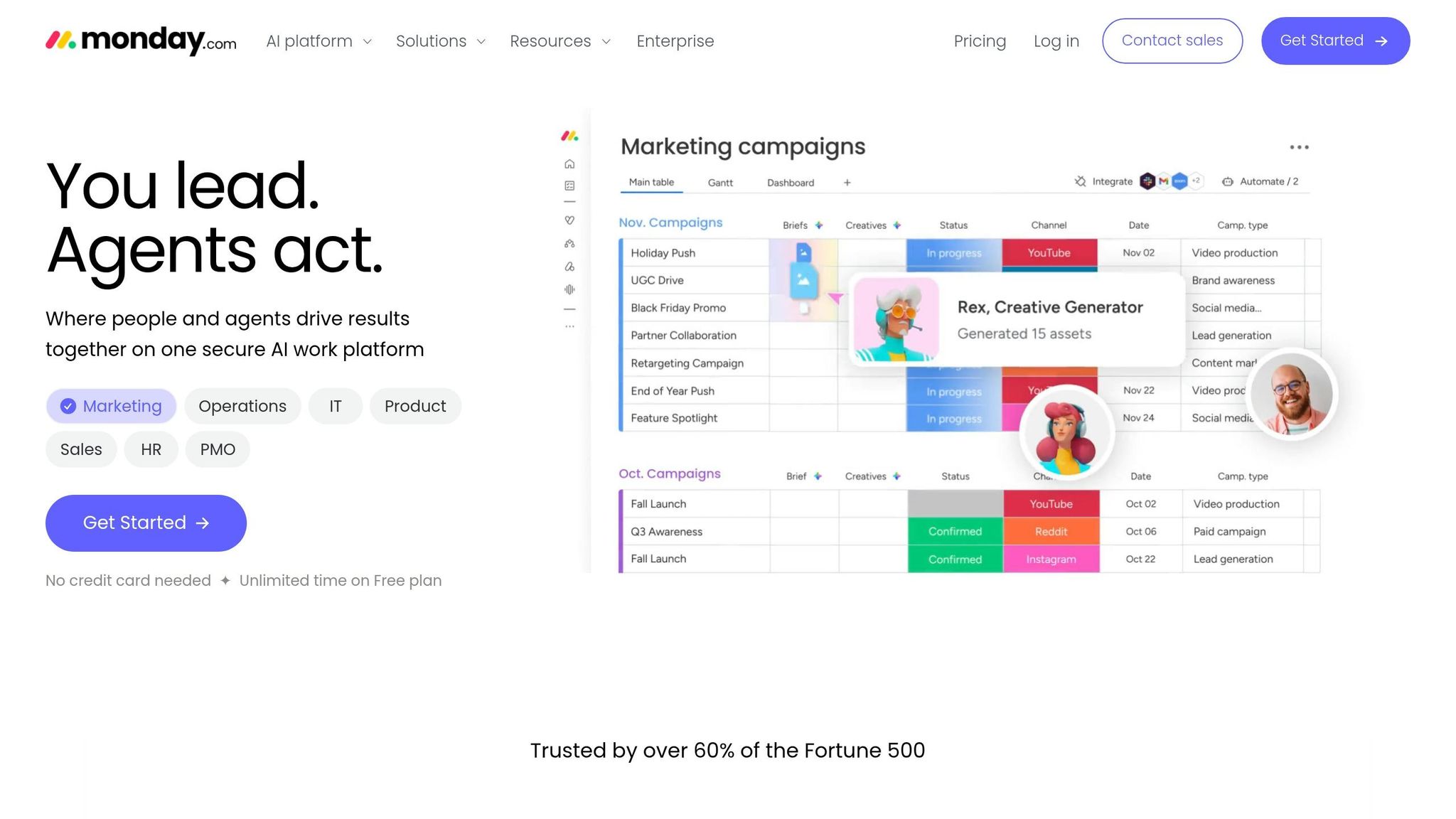
Monday.com is a workflow tool, not a CRE analytics platform. So it works better for deal tracking and project coordination than for investment reporting. That distinction matters. CRE teams need clear metric visibility, not just task management. While the earlier tools lean into analysis, Monday.com is strongest as a coordination layer.
CRE Metric Coverage
Monday.com can track pipeline stages, capital projects, lease expirations, and other metrics, but only through custom fields and manual upkeep [1].
Data Integrations
Most teams end up relying on exports and manual entry because Monday.com has limited native CRE data sync [1].
Reporting Workflows
Because teams build the metrics themselves, reporting depends on how consistently people update the board. It works well for task tracking. But CRE reporting is a different story. Those outputs rely on steady field updates and formula setup, which adds extra work on the front end [7].
5. Notion
Notion is a lightweight knowledge base, not a true CRE dashboard. It works best as a shared reference library for CRE teams.
CRE Metric Coverage
Notion can store rent comps, market notes, and deal files. But it does not calculate live KPIs or automate rollups.
Data Integrations
Most teams build Notion pages from spreadsheets and exported files. That slows updates and increases the risk of errors [7].
Reporting Workflows
Reporting is still manual. Teams have to update source files, manage version control, and format pages by hand [3][7]. So while Notion can support the input side of reporting, it doesn't offer live dashboarding.
6. Reonomy
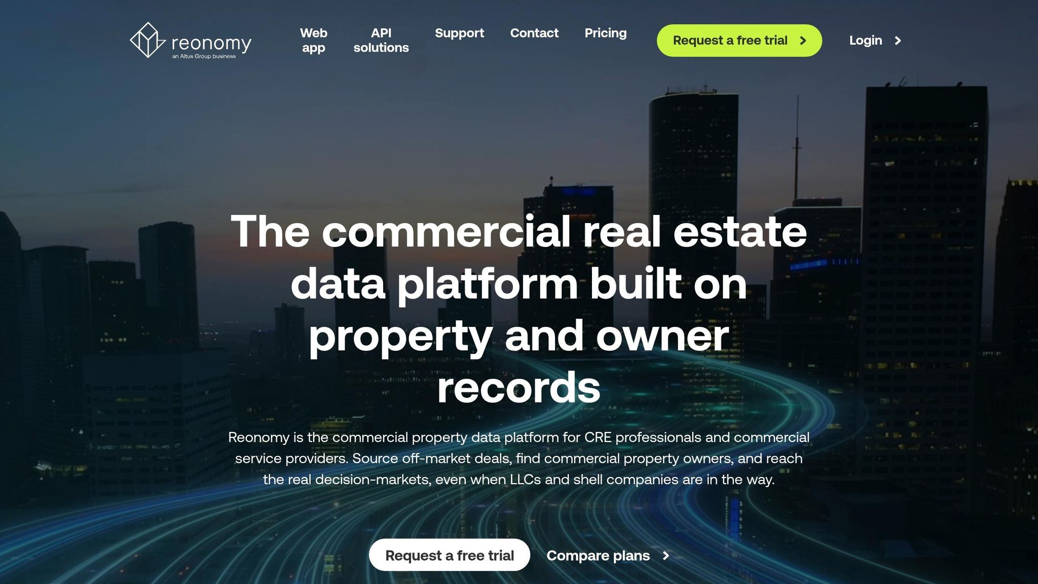
After internal reporting tools, Reonomy moves the process further upstream into sourcing and ownership research. It’s less of a dashboard and more of a property-intelligence layer built for sourcing and prospecting.
CRE Metric Coverage
Reonomy brings together ownership data, skip-trace and contact details, sales history, transaction activity, zoning, and tenant data. In plain English, it helps teams find the right properties, figure out who owns them, and reach out before underwriting even begins.
Data Integrations
The platform is built to export datasets into outside tools like Excel for deeper modeling. In practice, most teams pull Reonomy data into Excel or their underwriting models and do the number-crunching there.
Pricing Model
Reonomy does not list public subscription pricing. It’s sold as a professional tool, which usually means pricing is handled through sales conversations rather than a self-serve plan.
Reporting Workflows
Reonomy supports saved searches and alerts for tracking target properties over time. That keeps prospecting work organized, especially when teams are watching specific owners, areas, or asset types.
Its role is strongest before modeling starts, not inside the dashboard itself. It does not handle pro formas or sensitivity analysis.
7. Juniper Square
Where Reonomy helps source deals, Juniper Square takes over after the deal closes. It’s built for fundraising, investor administration, and ongoing reporting, rather than property-level operations.
CRE Metric Coverage
Juniper Square tracks metrics like NOI, portfolio value, and cash-on-cash return [7]. That makes it a better fit for ownership-level reporting than day-to-day asset management.
Reporting Workflows
Its reporting workflows cut down on spreadsheet handoffs by giving teams stakeholder-ready reports and one place for document management across LP and GP reporting [2].
Strengths, Trade-Offs, and Best-Fit Use Cases
Now that each tool is on the table, the choice comes down to workflow, not feature count.
The split here is about purpose, not price. Across these seven tools, the biggest difference is where each one fits: underwriting, operations, sourcing, or investor reporting.
CRE-native tools tend to win on speed and context. CoreCast stands out when underwriting, pipeline tracking, and reporting need to sit in the same system.
General tools give you more freedom, but they also bring more setup and upkeep. Monday.com and Notion sit even farther from financial analysis. They work well for workflows and docs, but they weren't built for underwriting or portfolio tracking.
Investor-facing platforms solve a different problem. Juniper Square is built for LP/GP reporting, while Reonomy is geared toward sourcing and prospecting.
Here’s the short version:
| Tool | Main Advantages | Main Limitations | Best Fit |
|---|---|---|---|
| CoreCast | AI-powered market research; automated investment memos; standardized underwriting [3] | Primarily focused on multifamily acquisitions [3] | Multifamily acquisition teams and syndicators [3] |
| Microsoft Power BI | High flexibility; integrates with existing Microsoft stack | High setup time; requires data engineering expertise | Large firms with dedicated internal data teams |
| Tableau | Strong data visualization and complex analytics | High cost; steep learning curve for non-analysts | Institutional data science teams |
| Monday.com | Workflow tracking | No CRE-specific financial modeling or data feeds | Internal operations and task management |
| Notion | Document management and internal knowledge bases | Not built for numerical analysis or portfolio roll-ups | Small teams needing a knowledge base |
| Reonomy | Strong property owner data and prospecting [4] | No comp data or market-intel benchmarking [4] | Off-market sourcing and cold outreach [4] |
| Juniper Square | Widely used for investor reporting and GP/LP portals | Too heavy for basic internal dashboards | Investor-facing reporting and fund management |
Those trade-offs shape the best-fit use case for each tool.
Conclusion
Across these seven tools, the deciding factor isn't features alone. It's workflow fit.
This comparison makes the clearest sense when you look at the day-to-day job each tool needs to handle: underwriting, portfolio reporting, sourcing, and team coordination.
Purpose-built platforms are usually faster to roll out for growing portfolios. General tools can still work, but they often need more setup before they feel ready for CRE use. And when institutional reporting is on the line, you need a platform that can hold up under lender and LP review.
For deal sourcing, Reonomy fits that role well. But it shouldn't be treated as a performance dashboard or a market intelligence tool.[4]
The biggest mistake teams make is simple: they buy a tool for the wrong job.
Start with the workflow bottleneck, not the feature list. The best dashboard is the one your team actually uses on a consistent basis.
FAQs
How do I choose the right CRE dashboard for my team?
Start by defining your goals. That might mean improving investor transparency, making reporting easier, or preparing your firm to handle more as it grows.
It also helps to look closely at your investor base. Different investors want different levels of detail, so your dashboard should match the reporting depth and features they expect.
When comparing tools, focus on options that work well with your existing systems. The right platform should also support real-time portfolio views, scenario modeling, automated reporting, and strong security controls.
When does a CRE-native tool make more sense than a general BI tool?
A CRE-native tool makes more sense when your team needs real estate-specific workflows like dynamic underwriting, pipeline tracking, and asset-level modeling.
General BI tools can help with broad visualization. But they often miss the built-in logic needed for work like rent rolls, lease expirations, and property KPIs such as NOI, IRR, and debt service coverage.
A purpose-built tool can also cut down on versioning problems and reduce manual spreadsheet work.
Which tool is best for underwriting versus investor reporting?
For underwriting, prioritize CoreCast as your central modeling tool across major asset classes and strategies. It gives teams one place to run dynamic analysis and keep a clear audit trail, which matters when assumptions change and people need to see exactly what happened.
For investor reporting, focus on tools that automate performance metrics and support customizable dashboards. The Fractional Analyst helps on both fronts by standardizing data and turning it into clear, professional reporting for stakeholders.