
How to Annotate CRE Data for Investor Presentations
Here’s why it matters: Investors need to quickly understand complex financial data. Proper annotation adds clarity, highlights key metrics, and builds trust. Without it, even the best opportunities might seem unclear.
Key steps to annotate CRE data effectively:
Organize and clean your data: Standardize formats (e.g., $X,XXX,XXX for currency, MM/DD/YYYY for dates) and fix errors before starting.
Focus on key metrics: Highlight critical figures like NOI, IRR, and cap rates to guide investor attention.
Use clear labels and visuals: Consistent naming conventions, color coding (green for positives, red for negatives), and simple charts make data easier to grasp.
Prepare for questions: Address risks and assumptions upfront to show thorough due diligence.
Pro tip: Tools like The Fractional Analyst can save time by automating annotation and creating polished investor materials.
Preparing CRE Data for Annotation
Before diving into annotations, it’s essential to have your financial data properly organized and formatted. This groundwork is critical for a smooth presentation and ensures you can effectively convey your investment opportunities. Simply put, the quality of your data shapes how well you can tell your story to potential investors.
Collecting and Standardizing Data
Start by gathering comprehensive data from sources like property management systems, accounting software, market research reports, and third-party databases. Make sure all data aligns with U.S. standards to avoid inconsistencies.
For clarity, use standardized formats: currency should appear as $X,XXX,XXX, and dates should follow the MM/DD/YYYY format.
Standardizing metrics is equally important. Key figures like net operating income (NOI), capitalization rates, and debt service coverage ratios must be calculated consistently across your portfolio. This consistency is crucial for investors who need to compare different properties or gauge the performance of a specific asset against the rest of your portfolio.
“Management teams need to identify the key drivers that will affect their analysis and capture those data fields systematically. Establishing clear data entry protocols ensures the information is accessible and ready for analysis ”
Data Cleaning and Processing
Raw data often contains errors or gaps that can damage your credibility with investors. Poor-quality data doesn’t just create confusion - it can lead to missed opportunities or even financial losses. For CRE professionals, these risks are too significant to ignore.
Data validation ensures your information meets quality standards by systematically checking it against predefined rules [4]. This includes verifying rental rates fall within market norms, ensuring expense ratios align with property types, and confirming the accuracy of all calculations. Setting database rules to accept only correctly formatted data helps maintain these standards [3].
The cleaning process is about addressing issues like duplicates, inaccuracies, and missing data. Each problem must be resolved before annotation begins, as these errors can undermine investor confidence during presentations.
Data normalization goes a step further by organizing information into a standard format to reduce redundancies and improve categorization [5]. For example, you might standardize property classifications (Class A, B, or C), ensure square footage measurements are consistent, or align expense categories across your portfolio.
Research suggests that improving data usability by just 10% can significantly boost revenue [3]. Even if your operation isn’t Fortune 1000-scale, the principle holds true: clean, reliable data can enhance investor trust and improve your ability to secure capital.
Organizing Data for Presentations
Once your data is clean and standardized, the next step is organizing it in a way that effectively tells your investment story.
Structure your data presentation to mirror how investors evaluate opportunities. Begin with high-level portfolio metrics, then dive into individual property performance, and finally present supporting market data and assumptions. This approach gives investors a clear overview before they examine the finer details.
Break your presentation into sections, each focusing on a specific aspect. For example:
Property details: Include location, size, type, and any standout features.
Financial performance: Highlight income statements, cash flow analysis, and key return metrics like IRR and cash-on-cash returns.
Market analysis: Cover trends, comparable properties, and demographic insights that support your investment case.
“Standardize your financial reporting across all properties to ensure consistency and comparability. Using the same time periods, expense categories, and calculation methods builds investor confidence in your data.”
“Consider integrating your property management and accounting software to streamline operations and improve accuracy. This integration minimizes manual errors and ensures your presentation reflects real-time property performance.”
Best Practices for Annotating CRE Financial Data
Turning raw commercial real estate (CRE) data into actionable insights demands precise annotation. By following these practices, you can ensure the data you present is clear, consistent, and impactful for investors.
Creating Clear and Simple Labels
Labels should be straightforward and standardized. Consistency in naming conventions across financial metrics and date formats is key. For example, always use formats like YYYY-MM-DD for dates to avoid confusion.
Avoid mixing styles like "NOI 2024" and "2025_Net_Operating_Income." Instead, stick to a uniform approach, such as "NOI_2024" and "NOI_2025." This consistency not only improves clarity but also simplifies data sorting and analysis.
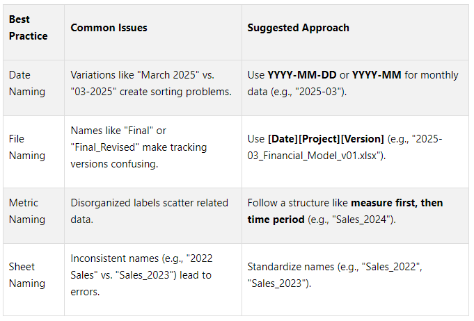
To further enhance clarity, use named ranges in formulas. For instance, replace generic references like =SUMIF(A:A, "2024", B:B) with descriptive names such as =SUMIF(Sales_Year, "2024", Sales_Amount).
Document these conventions in a reference guide so team members can adhere to them, reducing the need for reformatting later.
Using Visual Cues for Emphasis
Visual elements can help highlight key data points, making your presentation more engaging and easier to understand. The goal is to guide the reader's focus without overwhelming them.
Bold text: Use sparingly for headers or a few critical metrics.
Color coding: Apply consistent colors - green for positive trends, red for negative variances, and blue for projections. This helps differentiate data types at a glance.
Callout boxes: Highlight important insights, such as above-market rent growth or critical lease expirations, without disrupting the main flow.
Tailor your visual approach to your audience. Institutional investors often prefer clean, data-focused presentations, while private investors might respond better to visually dynamic charts and graphics.
Font hierarchy also plays a role. Use larger fonts for section headers, medium fonts for metric labels, and smaller fonts for detailed notes or explanations. This structure allows readers to quickly scan for key points while still providing depth for those who want more details.
Combining Automated Tools and Manual Review
Balancing automation with manual oversight ensures both efficiency and accuracy. Automated tools can handle repetitive tasks like standardizing formats, flagging outliers, and verifying calculations. However, human reviewers are essential for interpreting complex data and catching nuances that software might miss.
For example, automation might standardize lease data, but a manual review can identify specific market assumptions or lease terms that require deeper analysis. Employing consensus validation - where multiple reviewers verify critical data - can further enhance accuracy.
To optimize this hybrid approach:
Use automation for routine tasks like formatting and calculations.
Focus human efforts on high-impact areas, such as interpreting complex data points or verifying assumptions.
Regularly evaluate your process, incorporating feedback to improve both automated systems and manual reviews.
Visualizing Annotated Data for Investor Impact
Turning annotated CRE data into visually engaging materials can significantly enhance investor understanding. Just as precise data annotation highlights critical metrics, well-crafted visuals simplify complex information into clear, actionable insights. Research indicates that visuals improve comprehension and retention by 70% compared to text-heavy documents, and organizations using data visualization report a 40% faster decision-making process [6].
Designing Charts and Tables
The first step in creating effective visuals is choosing the right format for your data. For instance, heatmaps are excellent for pinpointing areas with high appreciation potential across neighborhoods or property types. When analyzing rental income, bar graphs comparing rental yields by neighborhood offer an immediate and digestible snapshot for investors.
Line charts work well for highlighting long-term trends, especially when you overlay key market events to show performance patterns. Color-coded maps can emphasize high-yield rental areas, while interactive features allow users to explore details without overwhelming the design.
When constructing comparison tables, prioritize metrics that investors care about most - such as cap rates, cash-on-cash returns, and internal rates of return. Use clear formatting to make distinctions between properties obvious. Pie charts can also be effective for showing market share, helping investors understand how a property or portfolio fits into the broader market. These visual strategies ensure clarity and professionalism.
Maintaining Consistent Formatting
Consistency in design reinforces professionalism and builds trust. Stick to standard U.S. formats and ensure precision across all metrics.
Use a uniform color scheme and clear font hierarchy to guide attention. For example:
Green for positive performance
Red for negative trends
Blue for neutral or projected data
These color associations, when applied consistently, help avoid confusion. Additionally, present square footage using U.S. measurements with proper formatting (e.g., 2,450 sq ft).
Customizing Visuals to Investor Needs
Beyond clear design and consistent formatting, tailoring visuals to your audience makes them more impactful. Institutional investors often prefer concise, data-rich charts, while private investors may respond better to simplified, visually engaging graphics.
Create a narrative flow by emphasizing trends over time. For example, an infographic could illustrate the growth of a suburban area with rising employment rates, using icons and charts to show the influx of businesses and the resulting spike in housing demand. This approach helps investors visualize opportunities for capital appreciation and rental income.
Interactive elements - like time sliders, clickable property markers on maps, or expandable sections for detailed assumptions - can further engage investors, letting them explore the data at their own pace.
Each visual should focus on a single key insight. For instance, a chart showing rent growth trends should stick to that metric rather than trying to incorporate occupancy rates or capital expenditures. This clarity helps avoid overwhelming your audience and ensures your message is easily understood.
Finally, tie each visual back to actionable investment decisions. Whether you're showcasing above-market rent growth potential or identifying the best timing for acquisitions, your visuals should guide investors toward clear conclusions that align with your overall investment strategy.
Transform Your Real Estate Strategy
Access expert financial analysis, custom models, and tailored insights to drive your commercial real estate success. Simplify decision-making with our flexible, scalable solutions.
Using The Fractional Analyst for Annotation and Analysis

The Fractional Analyst Home Page
When it comes to annotating and analyzing commercial real estate (CRE) data, The Fractional Analyst simplifies what can often feel like an overwhelming process. CRE professionals frequently spend hours formatting spreadsheets, building custom models, and double-checking data accuracy - time that could be better spent on strategic initiatives. That’s where The Fractional Analyst steps in, offering specialized financial analysis services tailored to the unique demands of the CRE industry. This service helps you prepare for advanced annotation and presentation techniques without the usual hassle.
The increasing demand for data expertise in real estate mirrors broader market trends. For example, MarketsandMarkets projects that the global Data Annotation and Labeling Market will grow from $0.8 billion in 2022 to $3.6 billion by 2027, with a CAGR of 33.2% [10]. Additionally, 28% of U.S. businesses have already adopted Fractional Analyst services, a figure expected to climb to 35% by 2025 [9].
Overview of The Fractional Analyst Tools and Services
The Fractional Analyst offers tools and services designed to make data annotation and investor presentations easier and more effective. Their offerings include both direct services and a self-service platform called CoreCast, which provides real estate intelligence tools.
Here’s a breakdown of their core services:
Underwriting support: Analysts handle complex financial modeling and due diligence calculations, saving you time and reducing errors.
Asset management support: They assist with portfolio analysis and performance tracking, helping you stay on top of your investments.
Investor and lender reporting: Transform raw data into polished, professional reports that strengthen relationships with stakeholders.
Pitch deck creation: Skip the struggle of designing and visualizing data for investor presentations. Their team creates materials that clearly communicate investment opportunities.
Custom tools and dashboards: Get tailored dashboards that provide both big-picture insights and detailed metrics, integrating seamlessly with tools like QuickBooks, Google Analytics, Excel, and SQL databases [8].
“A Fractional Analyst will build the tools, dashboards, and analysis you need as a business owner in order to make strategic decisions.”
They also offer free downloadable models to support various needs, including multifamily acquisitions, mixed-use developments, IRR matrices, portfolio roll-ups, lease abstracts, and amortization schedules.
Benefits of Expert Help
By leveraging The Fractional Analyst’s expertise, you can elevate your CRE analysis and operations in several key ways:
Save time: Instead of spending hours formatting data or creating charts, focus on strategic decisions and building relationships.
Boost accuracy: Professional analysts are skilled in CRE financial modeling and can catch errors that might go unnoticed, ensuring your materials are error-free.
Cost efficiency: Hiring a fractional analyst is far more affordable than bringing on a full-time hire, especially for smaller firms or those with fluctuating workloads [8].
Improve investor communication: Professionally prepared reports and presentations not only look polished but also enhance credibility with investors and lenders, potentially leading to better deals [7].
Adapt to your needs: Whether you need part-time help for a few weeks or full-time support for months, fractional services scale to match your project’s demands [7].
Getting Started with The Fractional Analyst
Starting with The Fractional Analyst is simple and low-risk. Their free downloadable models are a great way to explore the quality of their tools without any upfront cost.
For more comprehensive needs, custom analysis is available through consultation. Pricing options include:
"Buy In Bulk": Ideal for handling multiple projects.
"Data Partnership": Designed for ongoing collaboration.
"Enterprise": Suited for larger organizations with complex requirements [8].
The CoreCast platform is another option, offering self-service tools at competitive per-user pricing. This is perfect for teams that want professional-grade tools while keeping control over their analysis process.
Custom analysis is priced based on your specific needs, so you only pay for what you require. This flexibility is particularly useful for one-off projects or when the scope of work isn’t immediately clear.
To get started, download the free models and see how they fit into your workflow. From there, you can consult with their team to identify the services that align with your goals and budget. Many CRE professionals begin by using fractional services for a single project - like preparing data for an investor presentation - and expand their usage as they experience the benefits of saved time and improved quality. With these tools and services, your investor presentations can become more precise and impactful, helping you stand out in the competitive real estate market.
Conclusion: Key Points for Annotating CRE Data
Turning raw commercial real estate (CRE) data into actionable investment insights requires a focus on preparation, visualization, and precision. Clean, standardized data paired with clear visual hierarchies and consistent formatting helps investors quickly identify opportunities.
The foundation of effective CRE annotation lies in contextualizing key metrics - like NOI, cap rate, and cash flow - within the framework of local market trends, property demand, and regulatory considerations.
“Understanding market dynamics enables better assessments of property value, infrastructure and long-term demand, ensuring investments align with current and future trends.”
Incorporating risk assessment into your annotations is equally essential. Highlight potential challenges and outline mitigation strategies, such as analyzing loan terms, sales comparables, and tax implications. These steps refine your data presentation and set the stage for professional support, like the services offered by The Fractional Analyst.
From a technical standpoint, tools like consistent color coding, clear labeling, and strategic visual cues make navigating complex models easier for investors. These small but impactful details ensure your presentation remains focused and accessible.
For CRE professionals aiming to elevate their presentation quality without sacrificing time, expert support can make all the difference. The Fractional Analyst provides a range of resources, including free downloadable models, custom analysis services, and the CoreCast platform. Whether you need a quick resource or ongoing analytical expertise, these tools can help you craft professional-grade investor materials.
FAQs
-
When preparing commercial real estate (CRE) data for investor presentations, focusing on metrics that highlight financial performance and investment potential is key. Important financial indicators include Net Operating Income (NOI), Capitalization Rate (Cap Rate), Internal Rate of Return (IRR), Cash Flow, and Cash-on-Cash Return. These numbers give investors a clear picture of profitability and expected returns.
Operational metrics are equally important. Metrics like Occupancy Rate, Tenant Retention Rate, and Operating Expense Ratio (OER) provide insight into how well the property is performing and how efficiently it’s being managed. Additionally, financial leverage metrics, such as the Loan-to-Value Ratio (LTV), help outline the risk associated with the investment.
By presenting these metrics clearly, you make it easier for investors to understand the property's value and potential. For additional support, tools like The Fractional Analyst offer expert analysis and free financial models tailored for real estate professionals, making the process even more efficient.
-
The Fractional Analyst streamlines the process of preparing CRE data by providing personalized financial analysis, in-depth underwriting, and thorough investor reports. These tools are designed to emphasize critical metrics, ensuring your presentations align perfectly with your investment objectives.
By combining expert insights with customized solutions, The Fractional Analyst not only saves you valuable time but also guarantees precision. This makes it simpler to craft polished, professional presentations that leave a strong impression on investors.
-
To design visuals that truly resonate in CRE data presentations, focus on three pillars: clarity, simplicity, and engagement. Start by using high-contrast colors to highlight key metrics, making the data easier to understand at a glance. Incorporate well-labeled charts, graphs, and icons that align with your message, ensuring they reinforce your narrative rather than distract from it. Keep the layout clean - stick to only the most relevant data and maintain a cohesive design style throughout.
It's also essential to tailor your visuals to match your audience's expectations. Strike a balance between providing high-level summaries and diving into detailed breakdowns when appropriate. Before presenting, test your visuals to confirm they’re easy to interpret and emphasize the insights you aim to convey. The ultimate goal? Transform complex data into something clear and engaging for your audience.